
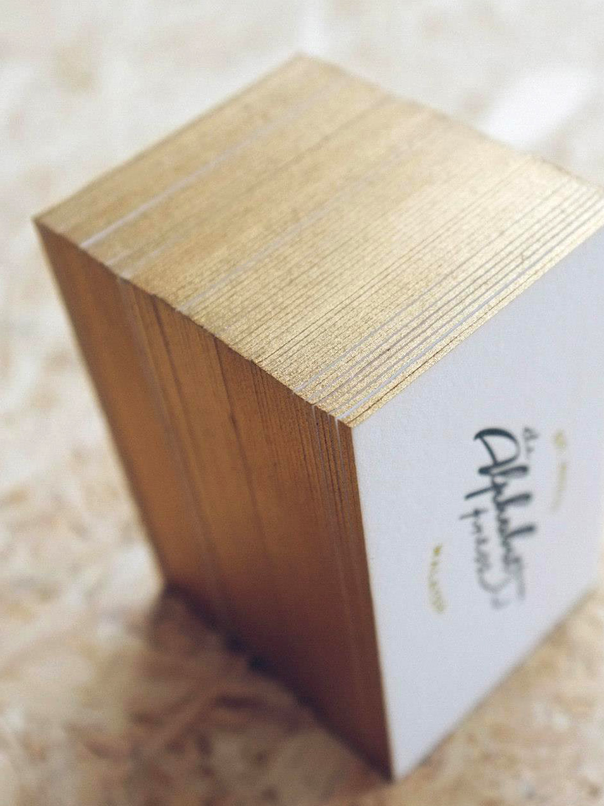
Letterpress printing is a 600-year-old relief process of print making that yields remarkable type and image results. We work with 14 base inks to mix the perfect colours, and each piece of paper is meticulously printed, one sheet and one colour at a time.
Pros
Ideal for spot colour texts and line graphic elements with one-of-a-kind craftsmanship
Cons
Not ideal for large solid inking areas as it may appear “salty”
Paper Options
300gsm, 360gsm, 450gsm, 600gsm cotton papers
Result
Tactile quality with deep impression which is commonly called “bite impression”

Offset printing technology uses plates, which are used to transfer an image onto a rubber “blanket”, and then rolling that image onto a sheet of paper. Best when larger quantities are needed because the more you print, the cheaper the price per piece.
Pros
Ideal for full colour CMYK graphic elements and photos with colour accuracy
Cons
Not ideal for production quantities below 1000pc
Paper Options
60gsm — 350gsm
Result
Flat, full colour printing with accurate colour reproduction, crisp, and clean professional look

Digital printing doesn’t use plates the way offset does, but instead uses options such as toner (like in laser printers) or larger printers which do use liquid inks. Perfect for low quantity print job (as low as 1, 5, 10 pieces) as it prints on demand.
Pros
Ideal for full colour CMYK graphic elements and photos
Cons
Unable to match the colour quality of traditional letterpress & offset printer and fewer material options
Paper Options
80gsm — 350gsm
Result
Flat, full colour printing

Hot Foil Stamping is a simple recipe of 3 ingredients – heat, pressure and the correct foil for the job. It adds value and a personal touch to the simplest of items and delivers a unique finishing touch.
Pros
Ideal for adding a highlight on texts and graphic elements
Cons
Rough surfaces are difficult to stamp on
Paper Options
80gsm – 600gsm colour or cotton papers
Result
Highly reflective image with a bright and metallic appearance

Embossing & Debossing involves the use of two metal dies which fit into one another. One is raised at the surface and the other is recessed into it. This technique is great for enhancing your prints and bring attention to specific elements of your design.
Pros
Ideal to highlight important details, such as logo, graphic or names
Cons
Not ideal for font sizes below 8pt due to concern of readability
Paper Options
70gsm — 600gsm
Result
Adds a tactile dimension to your print but leaves a mirrored indentation of the embossed area on the other side of the paper stock
Edge Colouring is a specialty production process that can bring spectacular results to cards. This simple yet classical finishing completes the visuals and elevates the cards qualities.
Pros
Adding edge colouring onto your cards expresses one of the most eye-catching finishes
Cons
Not ideal for paper stocks below 350gsm
Paper Options
350gsm — 600gsm
Result
Showcases your dedication of attention to detail as the card looks effortlessly luxe and lavish

Die Cutting is a process used in many different industries to cut a thin flat material (in our case, paper) into a specific shape using a steel cutting die. You can create the same shape, with the exact same dimensions, over and over without the use of scissors, stencils or a craft knife.
Pros
Able to make complex shapes with the level of uniformity in the final product
Cons
Complicated shapes or patterns may not work
Paper Options
80gsm – 600gsm colour or cotton papers
Result
Creates unique shapes, edges and message windows in greeting cards

Blind Impression is a method of letterpressing paper without using any ink to create a subtle motif or pattern. The impression of the plate leaves a crisp clean sharp impression, especially on our thick 100% cotton papers, which create a (beautiful pillowy/beautifully pillowed) feel.
Pros
Ideally for big, bold texts or graphic elements
Cons
Not ideal for texts below 8 points
Paper Options
350gsm – 600gsm colour or cotton papers
Result
Crisp sharp impression to add subtle details to your card
Designing for letterpress requires a different approach to other print techniques you may be familiar with. Understanding this technique from a design and technical perspective is key to craft the best results of your letterpress print.
Typefaces
Set your types no smaller than 6pt to compensate for ink absorption.
Identify all thin lines and terminals, especially in script and italic typefaces. Sometimes, it may require an additional 0.1 outline stroke to ensure that it can be printed properly.
Convert all text to outlines, and increase tracking to at least +5 to compensate for print impression (the indentation) into the paper.
Reverse types set on a solid colour block should be no smaller than 12pt. Doing so is to avoid the type being clogged up with ink. To compensate for ink gain, you may need to add a small stroke to the type.
Images
Use vector-based images whenever possible.
If you are using hand-drawn artwork or scanned images, all images must be converted to line art.
Raster images can be letterpress printed. However, it requires specific effort in setting up the image in Bitmap mode. To achieve this, select Image > Mode > Greyscale in Photoshop. After that, convert it again via Image > Mode > Bitmap. The output resolution must be set at 1200dpi with a 50% threshold or halftone screen method. For best results, we recommend adjusting image levels and tone before converting to Bitmap mode.
Colours
Use Pantone® Uncoated spot colour only. Avoid CMYK process colours at all times.
It is not advisable to print white ink on black or dark coloured paper stock. The dark colour stock will show through the white ink. If you would like to use a dark coloured paper, metallic inks are recommended.
Strokes Weight
Lines and strokes should be set at 0.6pt or thicker. If it is an isolated line, please make sure the thickness is at a minimum of 0.6pt.
Bleed & Crop Marks
Set bleed for all elements at 5mm and export with crop marks. Export your AI or PDF with the 0.6pt stroke weight crop marks and 5mm of bleed.
Print Size
50 x 90mm (minimum) – 150 x 220mm (maximum)
Parallel Borders
An additional fee is applicable for artwork which features a continuous border within 5mm, and running parallel to the edge of your finished piece. The reason behind this is that cotton papers are extremely soft, and therefore difficult to cut straight in large volumes.
Wastage is exaggerated with borders parallel to the edge of finished pieces, and to compensate that, we must print in a greater volume as compared to the artwork without parallel borders.
Accuracy of Printing Registrations
Avoid putting 2 colours side by side. Due to the nature of letterpress and limitation of the machine, we ink the paper, one colour and one piece at a time. While putting on the second colour side by side with the previous colour, it has a big possibility to off register, and we can’t get the perfect impression. Unless you want the effect of overlapping colours, try to avoid this at all costs.
Large Solid Areas
Use solid fills moderately. Letterpress can’t successfully reproduce large block areas of colour. We do not recommend flooding the entire page with large solid areas of colour as it reduces the total amount of printing impressions (debossed) available.
Ink coverage should be less than half of the total printable area, and more “white” area on paper than printed paper in the finished design.
Try to Avoid These
Solid areas of colour are not ideal for letterpress
Solid colour is difficult to control and there is variation of colours in each run. Some pieces may have darker ink density, while some may turn out to have lighter density. We keep a sharp eye on consistency while printing, despite that there are slight colour dissimilarity, simply because colour is added and controlled manually.
Solid area may appear “salty”
It may be necessary to print with less ink density in solid areas to keep the fine details in your artwork as crisp as possible. We call the resulting mottled ink appearance “saltiness”. Depending on the colour you have in combination with the paper, they may be more or less “saltiness” in the final printed pieces. Darker colour on cotton stock demonstrates a saltier appearance while light colour on smooth stock will show a less salty appearance.
Large solid area do not offer impression
Solid area of colours (colour flood) do not generally make use of the sculptural impression possible with letterpress printing. Text, line work and pattern are ideally best while graphic elements or text reversing out of solid areas are not. Knocked out artwork will not create much, if any, noticeable impression into the paper.
Large area of impression cause sheet distortion
Letterpress with heavy impression is physically altering the thickness of the paper. With large areas of artwork under heavy impression, the sheet may want to bubble or curl. We sometimes call this the “potato chip” effect. The more artwork area on a press sheet, the less likely it is that the final printed piece will lay completely flat.
Restriction is Not Always a Bad Thing
Every now and then, we appreciate freedom with no boundaries. But now we have learned to enjoy working with restriction. It is a characteristic of letterpress, and it makes you focus on what is essential.
Book a consultation
If you are interested in an in-depth session to go over details regarding your ideas, designs or to receive a quote for your project, we invite you to book an appointment with us.
Get an instant quote
Jump right in and explore the options to get an instant estimate of your personalised stationery.
Request a sample
If you’d like to have a feel for what we produce, order a sample pack to get better understanding to each printing method, paper stocks, and characteristics of our stationery.
‘Everything that is beautiful and noble is the product of reason and calculation.’
Charles Baudelaire